A Tale of Two Buttons
Description
This application was made for me (Carson). We picked three of my main hobbies, and one of my favourite activities. For the hobbies we chose: weightlifting, programming and music. The activity chosen was eating as I love to eat. In general, these are the four most common activities I do within a day, and all are integral parts of my day.
To capture these, we chose to split up the page into quadrants. Each quadrant describes one of these chosen aspects. We wanted a way to represent me doing these different actions throughout the day. So, we chose to have a draggable character able to be dragged from quadrant to quadrant. Each quadrant contains a single frame of the animation that will be played when the state is changed (which will be explained further later on in the article). Each image and animation representative of one of the aspects mentioned prior.
The first button is the character itself and henceforth will be referenced as the character button. The second button is a button that allows the user to toggle the state of character button, and will henceforth be referred to as the toggle button.
How the app functions is simple. When the character button is placed into one of the quadrants he snaps into place, and the action is primed. There are two different states the primed character button can be in: idle, and animating.
The toggle button follows the mouse, and allows the user to control the state of the character by toggling to animate or to stop. As mentioned prior, animations will play. Specifically these animations will play when the toggle button is clicked. To stop the animations the user must click the toggle button to stop.
10 Concept Sketches
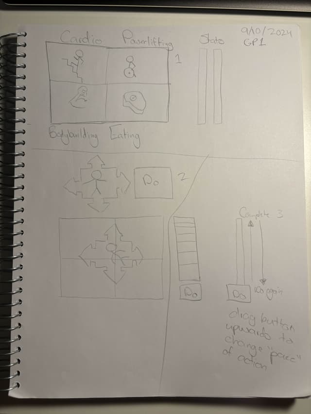
- Represents one of the initial quadrant ideas. For this idea, all the quadrants had something to do with exercise.
- One of the initial designs for how we can have a draggable character from quadrant to quadrant.
- A scraped idea where the button could be dragged up and down to do the action. All the way up and all the way down would be a complete repetition of an action. This was heavily tied to the idea of exercise.
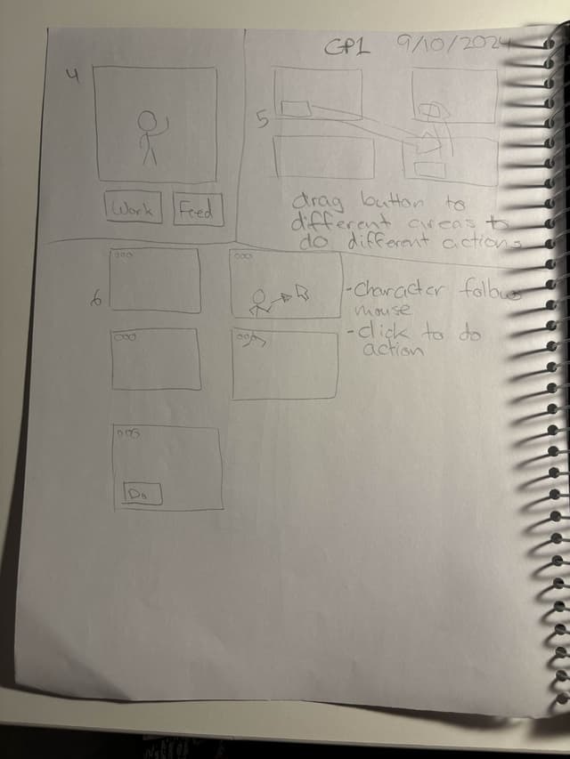
- A Tamagotchi-like idea where the two buttons would let you either force the character to work (program, workout, make music), or you could feed the character.
- One of the first ideas for how we can create an interaction between the quadrants and the draggable button. In this design, you would drag the button to a quadrant and click it inside the quadrant to do the action.
- One of the first designs for a button that follows the mouse. The idea was that you would put the mouse in the quadrant you wanted the character to do. Once the character was inside the quadrant you could make it do the action.
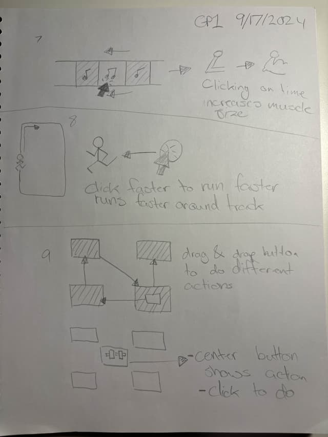
- For this design, the user could see an incoming stream of notes to press. If the correct note was pressed on time the character would workout harder and the muscle size would increase.
- An idea where simply clicking a button would make the character run faster around a track.
- Similar to a previous idea, you would drag one button to one of the quadrants. However, the button in the middle would change icons to be representative of the quadrant the draggable button was in. When you click the middle button, the character would start performing the action associated with the quadrant the draggable button is in.
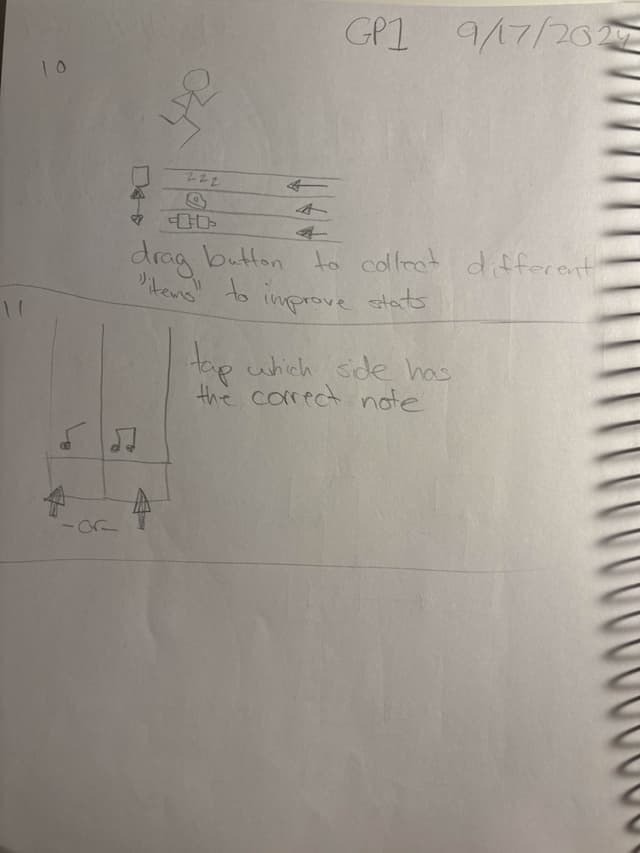
- Another music related idea, however with a more Guitar Hero-like approach. The draggable button here would allow you to collect certain powerups that would cause the character to progress through the day correctly. The character's state would change overtime, and more rapidly if properly chosen powerups were caught by the draggable button.
- A variation of above, but instead the user would click the correct note instead of collecting a powerup. The more correct notes, the faster the day progresses.
Refined Sketches
My Sketches
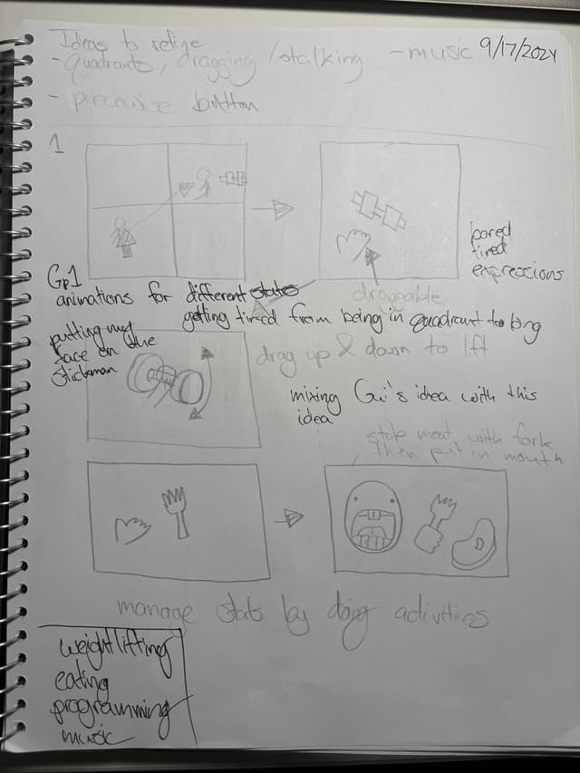
For this sketch, the idea that the character was one button and the hand was the other button. The user would drag the character into into the specific quadrant representative of an action, then another page would be displayed. In the second page the user would use the hand to perform the actions until they reach some end-condition. For example, ten repetitions of bicep curls. Once the end-condition was reached then the app would go back to the first page with the character button.
Stats was also an idea we were considering. Essentially, specific actions would increase specific stats. The idea was to balance the stats in order to "win".
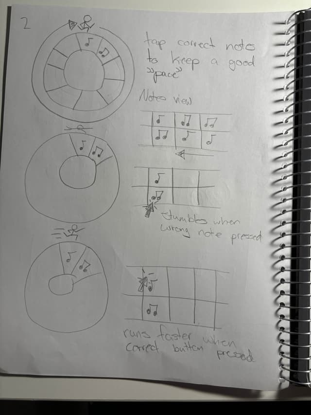
For this idea, the character would run on top of spinning circle that contained notes. These notes would be replaced with a different note after the user tapped one of the buttons.
The two buttons (on the right of the circle) would have different notes slide into them. It would be up to the user to match the current note the character is on to one of the two buttons.
If the user clicks the wrong button, the character would stumble. However, if the user clicks the correct button the character would keep running.
Eventually a complete song would be played by the user and the game would end.
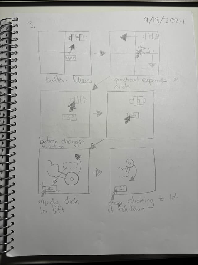
For this idea, the user would place their mouse in one of the quadrants. A button would follow the button and when clicked would open another page.
In the other page the user would see different options of actions to do and a different button. For example. they could click the button when hovering over the dumbbell to start lifting the dumbbell.
After that, the user would rapidly tap the button to complete the action.
Other Sketches
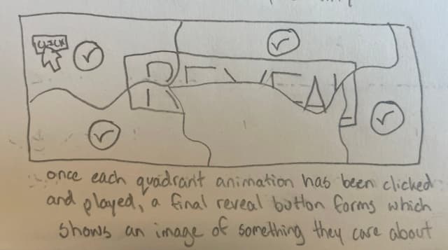
This is one of Alex's sketches. It showcases a piecewise button which was another one of the ideas we heavily considered. Essentially, each quadrant represents one of the actions and when the animation was completed another piece of the piecewise button was revealed. This would incentivize the user to complete all the animations and reveal the final form of piecewise button.
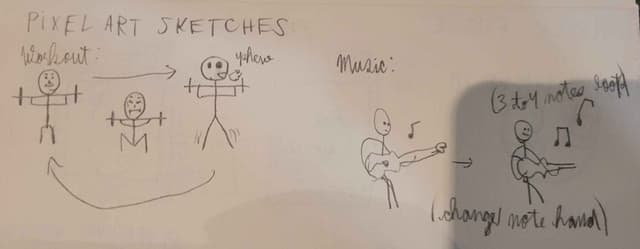
This is one of Guilherme's sketches that describes how we might animate the character. Animations became an integral part of the project and this showcases some of the early ideas Guilherme had for the end product animations.
Video + Final Product
Process
Implementation
As described in the description, our application uses four quadrants and two buttons. The first button is the character itself, and can be dragged from quadrant to quadrant. The second button allows the user to toggle the state of the animations. Each quadrant hosts the first frame of the animation, and once primed the second button allows the user to change the state of the character from idle to animating and vice versa.
Division of Work
Alex and I developed the application, while Guilherme created the assets. As how we split the programming, I worked on the buttons and the mouse context, while Alex worked on the quadrants and data context.
How Does Our Application Fit The Objective?
Our objective was to show important aspects of one of the group members, me (Carson) being the chosen group member, using only two buttons to drive the interaction between the webpage and user.
Our application shows import aspects of Carson (me) through the quadrants specifically. While the buttons themselves simply serve as a means to interact with these quadrants. These buttons are dynamic and have interesting interactions when compared to simple static buttons.
Thus, it fits the objective as it does represent some aspects of me, and maintains the limitation of having only two buttons.
What Worked and What Didn't Work?
I like how the buttons interact with the application and each other. They are far more interesting than any button I have seen on other websites, and provide a unique experience for the user. They drive the experience and are highly dynamic. Allowing us to have a lot of freedom in regards to the interactions that are possible within the application itself.
One thing that I think could be improved is some end condition. Currently, there is no end, or success/failure condition. A way of amending this would be to use some of the ideas in regards to statistics of the character, and balancing my life. It could use points or time to do so.
Another issue is that sometimes the buttons are very close together which may cause mis-clicks by the user. A way of amending this, which is something that is currently possible with the implementation, is to have the button stop earlier and farther away from the mouse. As stated above, this is already possible, and thus if it does pose an issue for users can be changed easily or dynamically by the user.